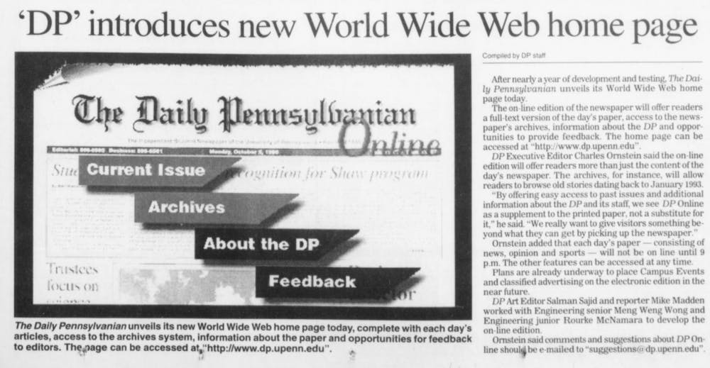
A clipping from The Daily Pennsylvanian on November 13, 1995, announcing our first foray into online journalism.
Welcome to the new theDP.com. We’ve redesigned the site from the ground up to make it cleaner, easier to use and more reflective of the values of The Daily Pennsylvanian as a modern media organization.
We chose to start this project with a clean slate, recognizing feedback from readers that told us our website was clunky, hard-to-use and difficult to navigate. We wanted the website to reflect our identity not only as a newspaper, but as a multifaceted student publication. The website redesign reflects our 132-year history of publication, keeping students up to date with news from near and around campus, while updating the style to stay relevant to our current readers.
We designed our new homepage to best reflect what is happening on and around Penn’s campus. Stories are curated by editors and presented cleanly. Upon landing, you can see our top stories and most recent articles. Gone are dropdowns, sliders, and carousels — the stories are in a cleaner, more open layout that lets your eyes rest and focus on the most important feature: the stories.
As a 132-year-old publication, we have a rich heritage to preserve. To stay consistent with our history, we took motifs from older versions of the DP, such as thick black underlines and round sans-serif headlines, combined with modern design principles to create something that would be as familiar to an alumnus as it would be to an incoming freshman.
The DP is read, watched and heard in an entirely different way than it was in 1885. We designed the homepage to blend the old media hierarchy of curated top stories with the newer, newsfeed mentality of the 24/7 news cycle.
With more readers coming from social media, we don’t just have one front door to our website. Most people now enter the DP online via an article page rather than a curated and choreographed entity like a homepage. So, we designed articles to be easier to navigate. The sidebar now has our top articles, and recommended articles are right below the comments. Spacing and fonts have been tweaked to ease reading. We’ve added larger images and templates that allow for different kinds of stories. No longer are our article pages second-class citizens; every page is a landing page.
Online readership continues to grow, and the variety of devices used to read the DP has grown significantly over the past few years. We’ve created a mobile-first, responsive interface, and we have fine-tuned page load times to make the reading experience enjoyable on every computer, phone and tablet.
Today, we are launching a new site that has been built completely in-house by designers, programmers and editors at the DP. We’ve been working on this redesign for almost a year and we’re excited to finally release it to our readers.
We plan on updating the site with new features in the coming weeks. If you have any questions or concerns, please do not hesitate to contact us. On behalf of the 132nd board of The Daily Pennsylvanian, thanks for visiting.
Andrew Fischer is the Director of Online Projects at the Daily Pennsylvanian, and coded the website. He can be reached at fischer@theDP.com. Creative Director Joyce Varma and Online Graphics Editor Kate Jeon designed the site. Joyce can be reached at varma@theDP.com. Kate can be reached at jeon@theDP.com.
The Daily Pennsylvanian is an independent, student-run newspaper. Please consider making a donation to support the coverage that shapes the University. Your generosity ensures a future of strong journalism at Penn.
Donate


