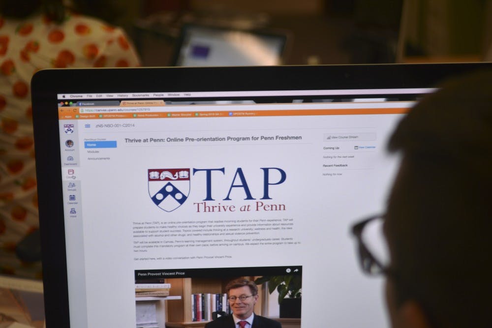
According to Canvas at Penn’s blog post about the May 16 user interface update, everyone would “jump for joy over the new Canvas UI!” But to students, while a welcome change, the update was largely inconsequential.
Rising College sophomore Michaela Tinkey, who is taking MATH 104 during the first session this summer, said that since the change, she has “only looked at Canvas like once.”
In fact, this was highly intentional. “We picked this time ... to minimize disruption for users,” Molly Bonnard, the courseware services manager for Canvas at Penn, said.
Tinkey agrees that this was a good course of action, saying, “It’s probably smartest to [update] now because there are going to be less students on campus.”
May 16 was not just chosen in order to facilitate transition. “A lot of [Canvas’] major changes ... will be optional for a really long period, and then be mandatory after a certain period,” Bonnard said. ”[The UI update] is going to be mandatory on the ninth of July.”
Bonnard has a positive outlook for the update. “You’re not going to have to relearn Canvas. It just looks different,” she said.
Anthony Nardone, a rising College sophomore looking to transfer into Engineering, is taking both a fine arts course and a chemistry course this summer. He uses Canvas for the chemistry class. “It’s a lot more modern,” Nardone said.
According to the Canvas at Penn blog post detailing the update, the two major changes are the “User Dashboard” and “Global Navigation” menu. The dashboard allows students to choose between viewing course notifications or “course [cards] for each of your favorite courses” as the default screen.
The menu functions similarly to the navigation bar across the top of the old UI. The motivation for the move was to “allow more room for content on smaller resolution devices.”
To Nardone, this was the most significant change. “On my Surface I have a touchscreen, so when I touch the drop-down, it would drop down, but when I would release my finger, it would disappear. ... Now I can just click on it, and there’s ... the next thing I can pick,” he said.
The one update that wasn’t simply a design change gives users the ability “to add nicknames and color code their course.”
Even though she hasn’t spent a lot of time on Canvas since the update, Tinkey believes the change is positive. “I think it’s a little easier to understand,” she said.
“Everything seems like it’s a lot more user-friendly,” Nardone agreed. However, while students appreciate this update, there are issues they feel need to be addressed.
“Canvas can be unreliable and that’s just too much of a risk to take when dealing with your grades,” Tinkey said. Particularly, she laments that “a lot of professors won’t change their grading style to match if Canvas isn’t working well.”
Nardone also expresses complaints surrounding the way professors use Canvas. “I think a lot of it depends on the teacher — to make it really user-friendly or to really make it easy,” he said.
Some professors, however, can make it more challenging. “The physics department makes it very confusing. You would have one [course page] for a combined set, one for lab. There are so many different things,” Nardone said. “Just put everything in one place! It’s really not that hard.”
Perhaps the more straightforward and simple interface that came with this update will reduce this kind of confusion. If not, Bonnard said that “[Canvas’s] big conference is in July, so that’s probably when they’ll say what’s happening next.”
The Daily Pennsylvanian is an independent, student-run newspaper. Please consider making a donation to support the coverage that shapes the University. Your generosity ensures a future of strong journalism at Penn.
DonatePlease note All comments are eligible for publication in The Daily Pennsylvanian.


